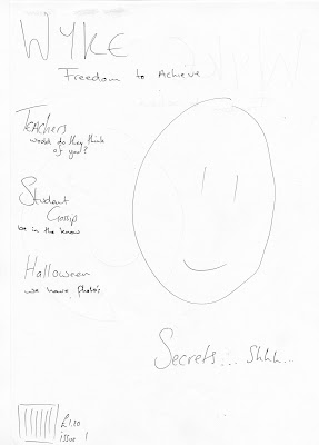
for my project, i was given the task of creating a front cover for a college magazine.
my first task was to research. for this project i had to research many things like the codes and conventions for both the front cover and a context page, the difference between a college magazine and a fashion magazine and i created a mood board for inspiration of the college. i was told that i would have to create a blog and this would be where all my work would be shown.
with this research i was able to start my planning. firstly i had to create hard copies of a plan for the front cover and the context page. this helped with arranging my magazine.
the picture i used was a student that agreed to be on my front cover. in the photo i took, it seems like he is rather shocked or excited to see something which goes great with the main cover story. the disadvantage for this photo is that it was taken with a bad choise of camera, so now the photo seems to be filled with grainness.
the font for the main cover story is similar to the masthead, the difference i used was the type of font. for the main cover story, the font seems more handwritten and for me, goes well with the "secret".
the price for this magazine came to an conclusion of both college and the price of a normal magazine. at a estimate of a normal fashion magazine that i have studied is £3 but college magazines are normally free. thats hwo i came up with the price of £1.20.
overall, the outcome of my magazine has come out better than i thought, i wished the photo could of come out better but it also matches the excitment that i hope the audience will notice.
Friday, 23 October 2009
the fonts

i thought for the fonts that i would stick with the colours of the college logo which is purple. i wouldn't use the same font as the college has but i have gone similar. again i have used photoshop to work with the fonts puttin in shadows, emboss and bevel.
the image on the side is an example of how i did the fonts on photoshop.
in the making
Friday, 16 October 2009
Tuesday, 13 October 2009
soft wares
the software i thought i could use to create my magazine would be photoshop and publisher. i chose these programs as i know how to use it more and could be used for better effects. and publisher being one of the dtp programs.
Monday, 12 October 2009
idea's for stories
for one lesson i have thought about what stories i would put down on my front cover and my context page. the ideas that i hav now come up with are:
- feed back of new tutor system
- secrets of this year christmas ball
- a student gossip page
- a story of why we have the rose garden
- battle of the sexes ... difference of how we learn
- winners of dogde ball
- red nose day ... how are we celebrating ???
there will have to be more stories for the context page as i have come up with an estimate of 9-10 stories
Thursday, 8 October 2009
covers website
found a couple of great covers to use as research form a websit -http://images.google.co.uk/imgres?imgurl=http://www.magazine-templates.com/images/shop/college/college-01-300.jpg&imgrefurl=http://www.magazine-templates.com/shop/cart/index.php%3Fmaincat_id%3D10&usg=__4E-uiQthF1xUMLgVjRJV3P7G3ZY=&h=379&w=300&sz=40&hl=en&start=3&um=1&tbnid=BAcqg6_dvMo8kM:&tbnh=123&tbnw=97&prev=/images%3Fq%3Dcollege%2Bmagazine%2Bcovers%26hl%3Den%26safe%3Dactive%26sa%3DN%26um%3D1-
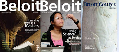
here are a couple of samples -


Monday, 5 October 2009
research for a front cover
to

http://images2.fanpop.com/images/photos/8200000/Magazine-Covers-33-avril-lavigne-8211267-550-768.jpg
looking through the Internet i found this cover for a magazine called ele Canada. i thought i could write down and deconstruct a few things that are important for a magazine to have on their front covers.
the masthead
a masthead for a magazine is usually found at the top of the page. this displays the name of the magazine so this heading is always important. the masthead is the visual branding of the title and is done in a way that is reconisale for he viewer. the masthead for this magazine is a huge and simple font yet very effective. although this font is sharp, it still brings in an audience of women. I've seen that this font has been used for many other women's fashion magazine.
dateline and bar code selling
this part of the magazine shows the year, month and day of the magazine. putting the date of the sale for the magazine helps people to go back to any issue if they have to. the bar codes for any magazine are there to help retailers sell the magazine.
the main image
for most female magazines, i have noticed on how most of the covers show a close up photo of one women mostly being a modal. looking at the camera. is this a way of drawing their target audience, which in this case, would be women. for this cover, the image shows a famous star named Avril Lavign. and shes posing for the front of a fashion magazine, making out that she is the main story for this issue. this could draw in many fans more than the usually readers.
also, with this cover, not only the layout for this magazine could be sold out to their target audience. they have set around a simple theme which comes out with a big effect. many things on this cover still stand out with the deconstruction.
conventions of a contents page
- page numbers
- sub- headings
- pictures
- contact information
- adverts
- little information about the magazine
- feature stories
- regular stories
- presentation
Subscribe to:
Comments (Atom)


